Enhance Mobile Shopping with the Best Shopify Theme

— 6 min read

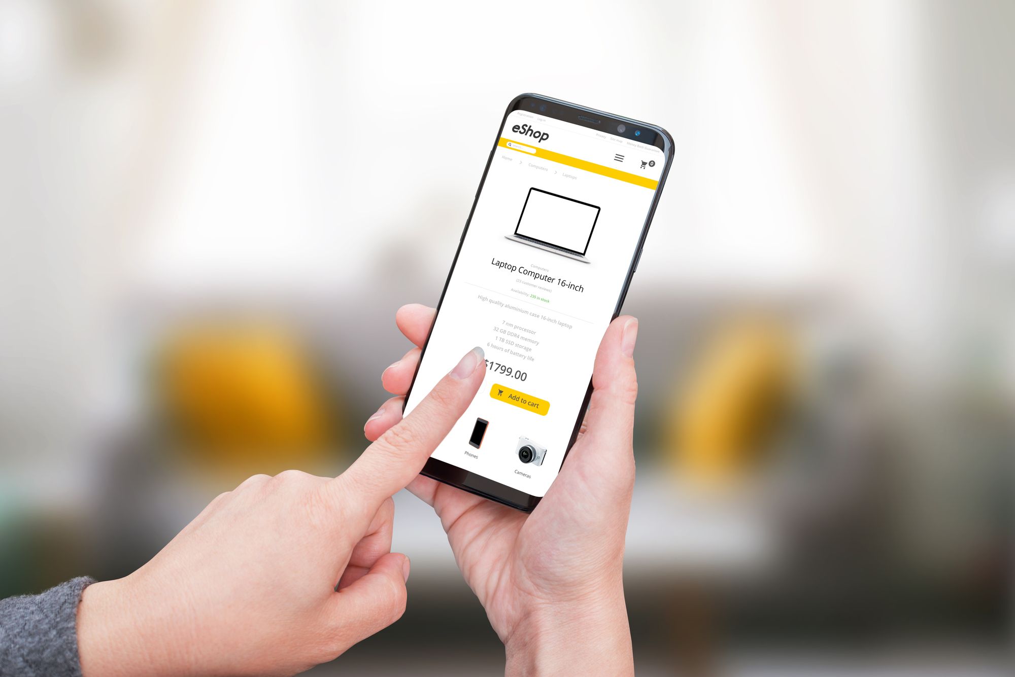
The world is witnessing a mobile commerce revolution. A significant majority of online shoppers now use mobile devices to browse products, compare prices, and make purchases. The days of relying solely on desktop traffic are long gone. That's why finding the best Shopify theme for mobile has become an absolute necessity for any online store.
Mobile screens require some adaptation. A great theme should have all the features needed for an optimized mobile shopping experience.
When choosing a Shopify theme for mobile, it's not just about aesthetics. Your theme should be a perfect blend of form and function – a visually pleasing design that offers an optimal user experience, especially for mobile users. It should be a mobile-friendly Shopify theme that loads fast, displays product pages correctly, and makes the checkout process seamless.
Let's find out how to optimize the mobile experience to boost your sales!
Responsive Design: A Key Feature of the Best Shopify Theme for Mobile
Responsive design is a critical aspect of the best Shopify themes for mobile. This design approach ensures that your online store's layout automatically adjusts to the screen size and orientation of the visitor's device, whether it's a desktop computer, tablet, or smartphone. This responsiveness enhances the shopping experience for your customers, regardless of their device.
When browsing the Shopify theme store for the best responsive Shopify themes, look for ones that not only boast a stunning look but also offer a smooth shopping experience.
The Mobile Shopping Future
In today's digital era, the growth of mobile commerce, or m-commerce, has been explosive. The convenience and accessibility offered by mobile devices have led to a shift in consumer shopping behavior, with a substantial number of customers preferring to shop directly from their smartphones.
Choosing the best Shopify theme for mobile use and optimizing your online store for mobile visitors has become an absolute necessity in order to successfully tap into this burgeoning market segment.
The best mobile Shopify themes are designed specifically with mobile users in mind, delivering a smooth, user-friendly experience across a wide range of mobile devices. A mobile-friendly Shopify theme ensures that your store is not only accessible on mobile phones but also appealing, ensuring that product images and information are easy to view and navigate on a smaller screen. This approach is vital to ensuring your store can successfully cater to mobile shopping trends.
The rise in m-commerce has also led to an increasing demand for responsive Shopify themes. A responsive design automatically adjusts your store's layout to fit the screen size of the device it's being viewed on. With responsive themes, whether your customers are shopping from a smartphone, a tablet, or a desktop, they will always have a seamless, high-quality experience.
The right mobile Shopify theme can enhance the mobile shopping experience, boosting your store's appeal and user-friendliness. This, in turn, can increase customer engagement, improve conversion rates, and ultimately drive business growth.
Remember, in the realm of e-commerce, your Shopify store theme is not just a visual element; it's a tool to help you succeed in the fast-paced and ever-evolving world of m-commerce.
The selection of the perfect theme for mobile use also ties into the wider strategy of embracing the future of mobile commerce. The trend towards mobile shopping is not slowing down; if anything, it's accelerating. Adopting a mobile-friendly Shopify store early can give you a significant competitive advantage, setting your store up for success as more and more customers make the shift to mobile.
Furthermore, utilizing Shopify themes for mobile use can make your product pages shine on small screens, ensuring all the necessary details are still viewable and easy to understand. Good mobile themes will guarantee your product images are clearly visible and product descriptions are easy to read on mobile devices, thus encouraging more purchases and minimizing abandoned carts.
It's clear that optimizing for mobile devices is no longer optional, it's a necessity. The best Shopify theme for mobile is the one that caters to your unique brand, offers a responsive design, and provides a seamless shopping experience for your customers. Whether it's a free Shopify theme or a premium one, make sure it aligns with your business goals and meets the needs of your mobile visitors. With the right mobile Shopify theme, you can offer a top-notch mobile shopping experience and keep your customers coming back for more.
Best Shopify Themes for Mobile
Choosing the right mobile Shopify theme can have a significant impact on your store's success. Here are some of the best mobile Shopify themes known for their superior performance on mobile device:
1. Turbo:Turbo is a highly responsive Shopify theme that offers a fast, seamless shopping experience on mobile devices. With its excellent loading speed, user-friendly design, and rich features, Turbo ensures your customers enjoy an unmatched shopping experience.
2.Flex: Known for its customization capabilities, Flex provides a fantastic mobile shopping experience. With this mobile-friendly Shopify theme, you can tailor your store's appearance and functionality to match your brand and cater to your mobile audience effectively.
3. Retina: This is another excellent Shopify theme for mobile. Retina's mobile-friendly design ensures that your product images and product pages look stunning and load quickly on all mobile devices. It's perfect for high-resolution images, making it an excellent choice for fashion stores.
4. Parallax: Parallax is a responsive Shopify theme that provides a long-form home page and a seamless scrolling interface, making it perfect for mobile users. It’s minimalist design ensures easy navigation and quick load times.
5. Story theme: Story themeis a theme designed for mobile shopping with optimized speed and display for all types of smartphones. This theme has the advantage of offering many interesting features for your e-commerce store. In particular, it is very easy to use and and it has ultra-fast loading speed.
Of course, there are other shopify themes that are perfectly suited to mobile devices. A minimal shopify theme, for example, is particularly interesting. Ergonomic and uncluttered, they're ideal for mobile shopping.
Optimizing Your Shopify Store for Mobile Devices
Selecting the best Shopify theme for mobile devices is undeniably an essential first step to enhancing your mobile users' shopping experience. However, it's critical to remember that this choice is just the beginning of the journey. Optimizing all elements of your online store to be mobile-friendly, from your product pages to your images and the checkout process, is equally crucial.
High-quality images are vital to showcasing your products effectively. However, it's key to remember that these visuals should not just be attractive but also optimized for speedy loading times. In the fast-paced world of m-commerce, slow-loading images can be detrimental to user experience, often causing frustration among mobile users and potentially driving them away from your store. To avoid this, consider using image compression tools or services that ensure your visuals retain their quality while keeping the file sizes small and quick to load.
Product pages, on the other hand, should be designed to be clean, concise, and user-friendly. Given the smaller screen real estate on mobile devices, long-winded product descriptions can quickly become overwhelming. Keep your product information brief, engaging, and easy to read to keep your mobile visitors interested and engaged. At the same time, ensure that important details about the product are not overlooked.
The checkout process is another critical element that needs careful consideration. It's a known fact in e-commerce that the simpler and more streamlined the checkout process is, the higher the likelihood of conversion. As such, you should aim to minimize the number of steps a customer has to take to complete a purchase.
Simplifying this process as much as possible can significantly improve your store's conversion rates, turning more mobile visitors into paying customers. For instance, consider integrating one-click checkout options or digital wallets that are popular among mobile users.
In conclusion, while selecting the best mobile Shopify theme is a crucial starting point, true mobile optimization goes beyond just the theme. It involves a holistic approach that factors in every element of the user's journey, from the product browsing stage to the final checkout.
With the right approach, you can build a Shopify store that not only looks great on mobile devices but also delivers a superb user experience that drives conversions and fosters customer loyalty.
WideBundle is expertly crafted to work seamlessly with mobile Shopify themes, providing a flawless and enjoyable shopping experience for mobile users. This compatibility is crucial as mobile commerce continues to grow exponentially, necessitating streamlined and mobile-responsive features.
WideBundle maintains its functionality across all device sizes, ensuring your sales promotions and bundle offerings display optimally on mobile screens. It doesn't matter whether you're using a free or a premium mobile theme, WideBundle adapts perfectly.
You have 14 days of FREE TRIAL, the app takes just 5 minutes to set up, and our extremely reactive customer support is available for you 7 days a week.